godaddy • efficiency • ai • inbox
Bulk Actions in Conversations
Helping business owners clean up their inbox in one move, not thirty.
TL;DR Summary
Business owners could only act on one conversation at a time, and NPS and FullStory both showed the frustration in a lack of bulk action functionality. The catch: the inbox loads 30 messages at a time, so a true “select everything” wasn’t possible at launch.
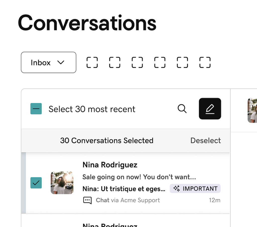
I audited the industry, explored three toolbar patterns, and ran three rounds of usability testing with 11 participants, changing the design after each one. The final round hit 100% task completion, and it shipped as one responsive pattern for desktop and mobile web.
Role
Lead Product Designer
Year
2025
Partners
Product Managers, Engineering, Content Designer
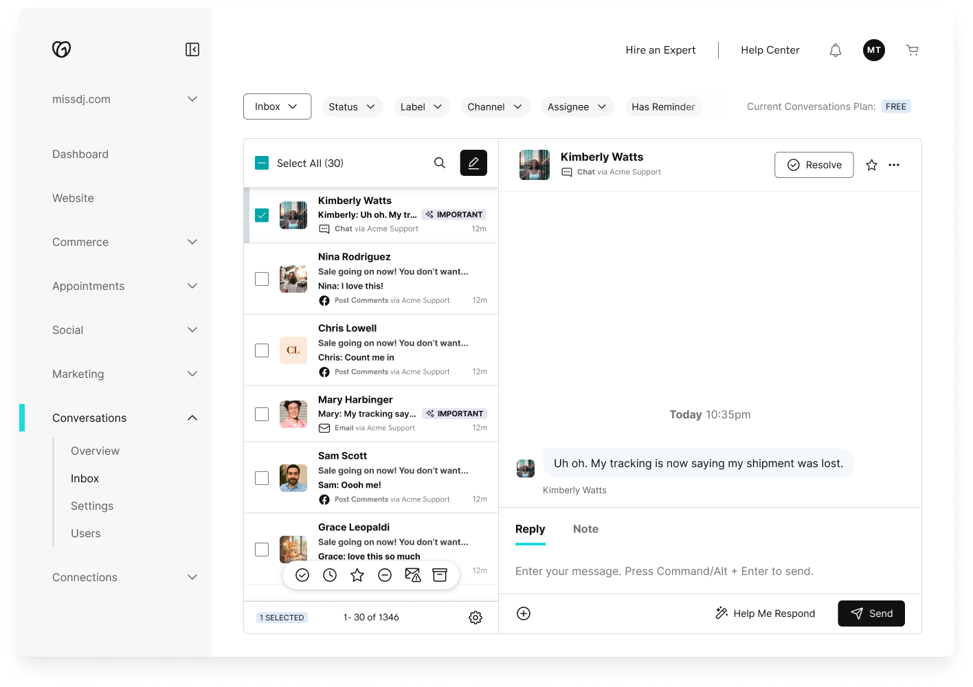
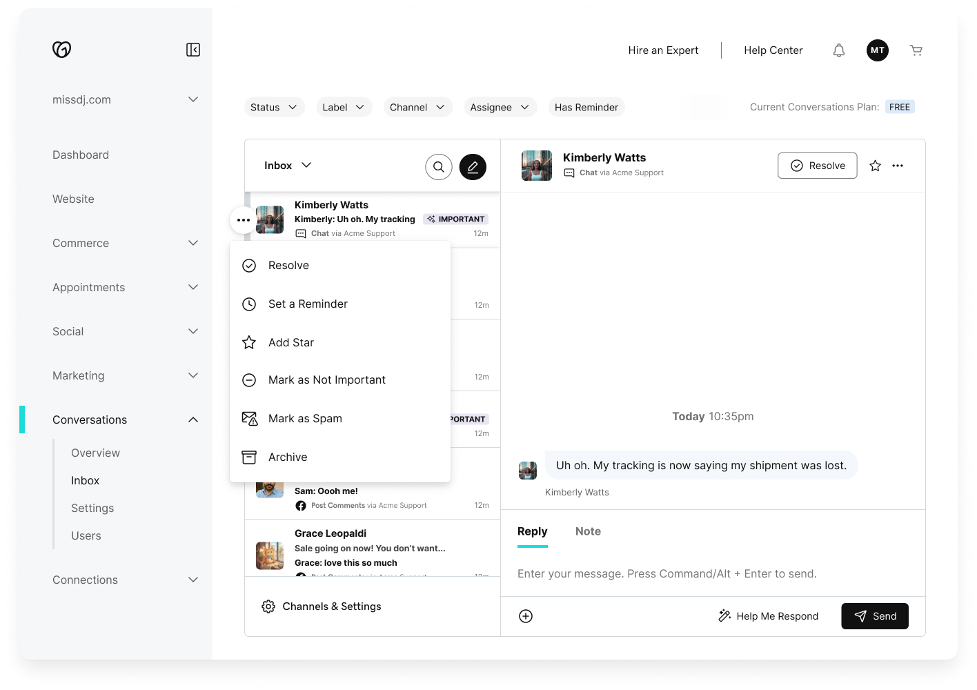
Drag to compare
Context
An inbox that grew faster than its tools.
GoDaddy is best known for domains. In practice, it's a one-stop shop for small businesses: commerce, point of sale, appointments, and more.
Conversations is GoDaddy's unified inbox. It pulls customer messages from Facebook, Instagram, email, website chat, contact forms, and WhatsApp into one place.
For high-volume users, that one place fills up and becomes unruly fast.
The Problem
Cleaning up 1,345 messages one at a time.
Cleaning up the inbox meant repeating the same action over and over. Conversations only let you act on one message at a time.
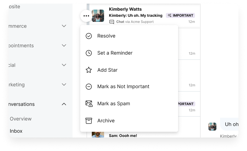
We heard it from two directions:
- NPS feedback repeatedly called out the lack of bulk actions.
- FullStory sessions showed business owners painstakingly starring, archiving, and marking conversations one by one.
The ask was clear. The answer wasn't. Bulk actions sound simple until you consider the constraints: an inbox that paginates, actions that vary by conversation state, and a user base that ranges from someone with 12 messages to someone with 1,300.
How might we let business owners act on many conversations at once, inside an inbox that only loads 30 at a time?
Research
Everyone has bulk actions. Nobody agrees where they go.
Industry audit
I looked at how inboxes and ticketing tools handle bulk selection. There was no single standard:
- Action buttons that appear in a right-hand panel once one or more threads are selected
- A sticky footer with actions
- A top toolbar that transforms into bulk controls (the Gmail approach)
No standard meant no free answer. We'd have to choose based on our own constraints.
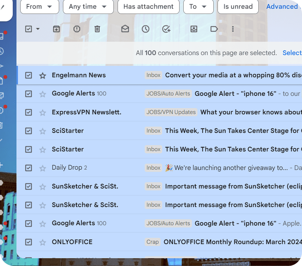
Gmail's approach: the toolbar transforms into bulk controls once a conversation is selected. Familiar to power users, but requires eyes to travel to the top of the screen.
Constraints
30 at a time, and no way around it.
With my PM, I turned the audit, user feedback, and system limits into requirements. Four constraints shaped everything:
- No true "select all." The inbox loads 30 conversations at a time and more on scroll. Selecting the whole inbox wasn't supported.
- No pagination rebuild before launch. Moving to true pagination wasn't possible in this release.
- Every screen size. The solution had to work on desktop and mobile web.
- Not every action is equal. Some actions are heavier on the backend, which could limit what we offered in bulk.
The first constraint turned out to be the whole story.
Concepts
Top, bottom, or right on top of the messages?
I mocked up three directions inside the existing UI:
The toolbar transforms into bulk controls when select mode starts. Familiar, but requires the eye to travel away from the content being acted on.
The Decision
The floating bottom toolbar solved the most constraints at once.
I evaluated the three concepts against what mattered most for this inbox:
| Top of page | Floating at bottom | Above the list | |
|---|---|---|---|
| Keeps messages above the fold | Yes | Yes | No, pushes the list down |
| Within thumb reach on mobile | No | Yes | No |
| One pattern for every screen size | Needs a mobile variant | Yes | Needs a mobile variant |
| Familiar to users | Yes (Gmail) | Less common | Somewhat |
The floating bar was the only option that worked the same way on every screen. Two details shaped the final execution: the toolbar is slightly translucent so users can see there's more content behind it, and a conversation count sits next to the pagination — "1–30 of 1,345" — so users understand that "Select All" applies to what's loaded, not the entire inbox.
Usability Testing
To users, "Select All" meant all. All 1,345.
I ran three rounds of testing with 11 participants and changed the design after each round. Every participant did the same four tasks:
- Star two messages
- Predict what "Select All" will do, then use it
| Round | Participants | What we learned | What I changed |
|---|---|---|---|
| 1 · Baseline | 3 | Checkbox selection worked. Most expected "Select All" to grab all 1,345 messages, some missed the toolbar, and "Star" was confused with the "Important" label. | Removed the competing "Important" tag from the test message |
| 2 · Labels and visual cues | 3 | Most found and used Star. 2 of 3 correctly predicted "Select All" would only grab what was visible. "Status" was mistaken for a folder. | Moved the selected-count label; toned down "Status" |
| 3 · Final validation | 5 | 100% task completion. Star felt intuitive. However, only 3 of 5 predicted "Select All" correctly. | Added the count to the label: "Select All (30)" |
The floating bar earned its place. In the final round, every participant used the toolbar without prompting, and several described the experience as "better than Gmail."
What Shipped, and What Didn't
Select All (30). Now it says what it means.
After three rounds, every participant could complete every task. Two problems were still open. I had to decide what was good enough to ship.
Shipped
- "Select All (30)." Putting the number in the label states the limit before anyone acts. It's a small change that directly answers the question 2 of 5 testers were still getting wrong.
- A toolbar entrance animation. Motion draws attention to the actions the moment selection begins, for the people who missed the toolbar.
- One responsive pattern across desktop and mobile web.
Deferred, on purpose
- "Select all 1,345." Users want it, but it needs a pagination rebuild we couldn't do before launch. The label fix makes the limit honest until then.
Reflection
The hard part was never the checkbox.
Bulk actions sound like a solved problem. Every inbox has them.
But the hard part wasn't the checkbox or the toolbar. It was being honest about a technical limit, and designing so users understood it before it surprised them.
Animation can do real work. Motion isn't only polish. The toolbar's entrance pulled attention to controls people were otherwise missing.
Designing for the smallest screen first saved a second design. Starting from mobile meant one pattern worked everywhere from day one.
What I'd do differently: I'd build a more flexible prototype. Ours had clicking and responsiveness bugs that shook testers' confidence in round 1, and it couldn't support scrolling, filtering, or scattered selections. While the user test confirmed usability, it didn't give much visibility into how users would actually use bulk actions in their own workflow.